
Schedulock: A Case Study
Schedulock is a Real Estate Showing Management mobile app and desktop platform based in Toronto, Canada. Through these platforms, Schedulock helps to manage the daily logistics of real estate brokerages and their agents. From scheduling showings, to agent-to-agent messaging, to finding the code for the lockboxes - Schedulock serves as a solution to automate the entire real estate process from listing to closing.
The Challenge
Our challenge was to redesign the current mobile app to reflect the feedback from the users, update the interface components and streamline the various user flows.
The Design Team
Each design team member brought a different skill set and area of expertise to the project. The main roles that I performed were UX Researcher, UX Designer, and Visual Designer. I helped to assess the initial research of the current users and identify many of the critical usability issues that would guide the project outcomes.

Throughout the UX process, I was a part of conducting the primary and secondary research, organizing the surveys and interviews with my Schedulock users, understanding the personas to identify the pain points, ideating new possibilities in the user flows, creating wire frames, giving feedback on the style guide updates, developing a working prototype of my assigned user flow and conducting the final feedback for continuing iteration suggestions.

0.1 RESEARCH
Analyzing Schedulock’s Position Amongst its Competitors
In meetings with the CEO, sales team and developer, our design team sought to understand the position of Schedulock in the real estate management market by researching the business angle of their main competitors.
We each conducted a Heuristic Analysis to assess the user interface designs of Schedulock’s competitors to get a better idea of what was working well or could be improved in other apps. Based on standards of evaluation created by the Nielsen Norman Group, I chose the top most relevant usability heuristics to compare and evaluate the quality of the apps.
The main usability heuristics that I looked at were:
Aesthetic and Minimalist Design
Interface should not have any irrelevant or excessive data
The content and visual design remains focused on the essentials
Recognition Rather Than Recall
Interface design should have visible and easy to recognize information
Should offer help in context and information reduction on the interface

Design Audit & Critical User Issues
After doing the competitive analysis and getting a better understanding of what is working and not working on the various apps, we sat down and took a critical look at the current app. Jon compiled this information into our critical usability issues chart which includes the level of priority, the issues found, and our recommendations moving forward.

Understanding the Schedulock Users
In order to best understand how to approach a redesign, we needed to understand who we were designing for and what they were trying to accomplish when using the app. We identified three separate types of users on the app: the listing agents, the buying agents and the brokerage. Each user has their own motives for using the app and each user needs to interact in some way with the other users.

By identifying the three different users and their unique purposes for using the Schedulock app, we were able to better understand how to approach the redesign of the app and solving the users needs as summarized by the “How Might We’s…”:
How might we redesign the Schedulock experience to attract more users and stay ahead of its competitors?
How might we integrate the functions of the desktop platform so users can do the same things with the mobile app?
How might we update the mobile app to address the critical usability issues and streamline the red routes for the users?

0.2 DEFINE
User Stories: What Schedulock Currently Offers
After the initial research and going through the feedback from the current users, we had a much better idea of what the users needed and what was possible for the redesign. We defined the three main users of Schedulock, compared their main competitors, and analyzed the comments from the users of the current app. Since we are not real estate agents, we wanted to make sure that we included all of the MVP tasks that were necessary to create the minimum viable product. Schedulock provided us with the user stories that we referenced as we created the base structure of the interface features of the app.

Sitemap
Jon created a sitemap for our design team to better understand the structure of the current Schedulock app so we could visualize how the screens were currently categorized. We used the sitemap to see the main sections of the app, the actions that could be done within them and how they were all connected. This helped us to see how the various user flows worked together for the user as they used the app to perform various tasks.

User Flows for the Red Route
Using the MVP tasks from the user stories and the categories that were defined with the sitemap, we began to identify the user flows that we would need to focus on redesigning. With each green category from the sitemap representing a main page of the app, we divided out the user flows amongst our design team.

I focused on the user flow: “Buying Agent User wants to request and schedule a property showing.”

0.3 IDEATE
Sketching out the Screens With New Possibilities
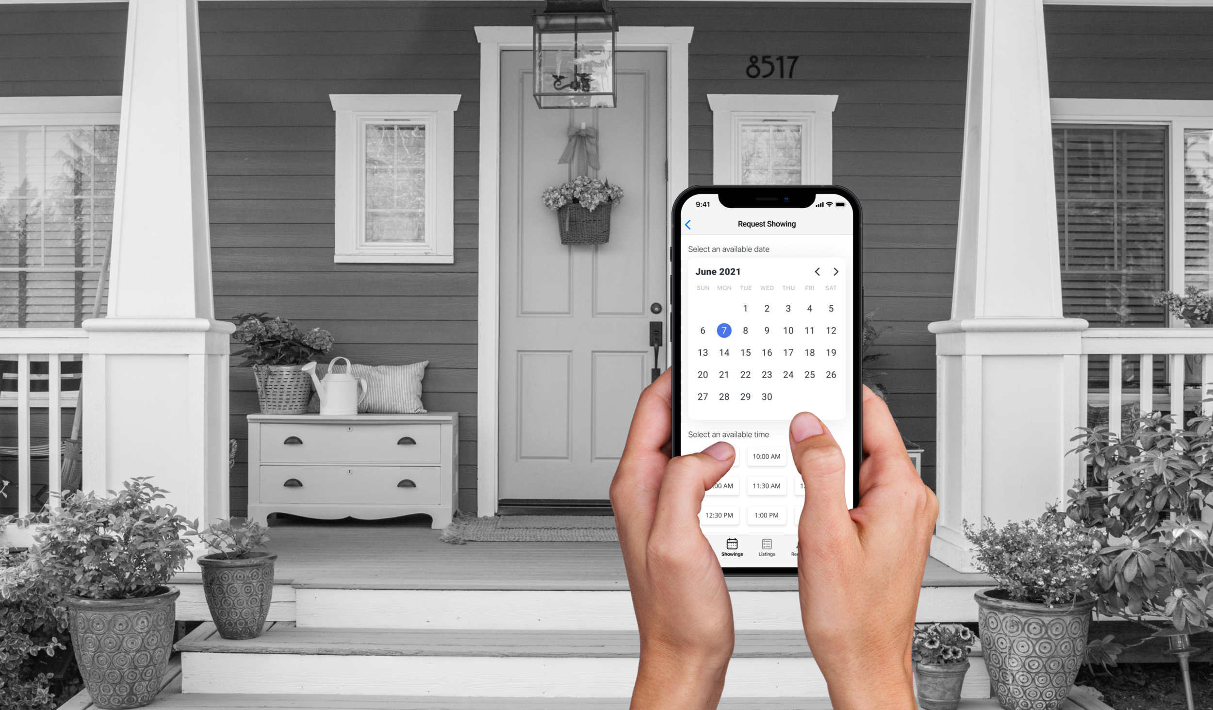
Each of us identified our most critical screen in our user flow. Since my user flow is centered around scheduling, I determined that my most critical screen is the calendar and scheduling page. The current Schedulock app was working with fill-in-the-blank dates and times using a ticker for the user to tick to the date or time that they want. I wanted to update the calendar and time components into something visually clear for users to understand with the most simple amount of user interaction. We began our brainstorming using the Crazy 8’s technique, a series of eight sketches exploring as many possibilities as possible.


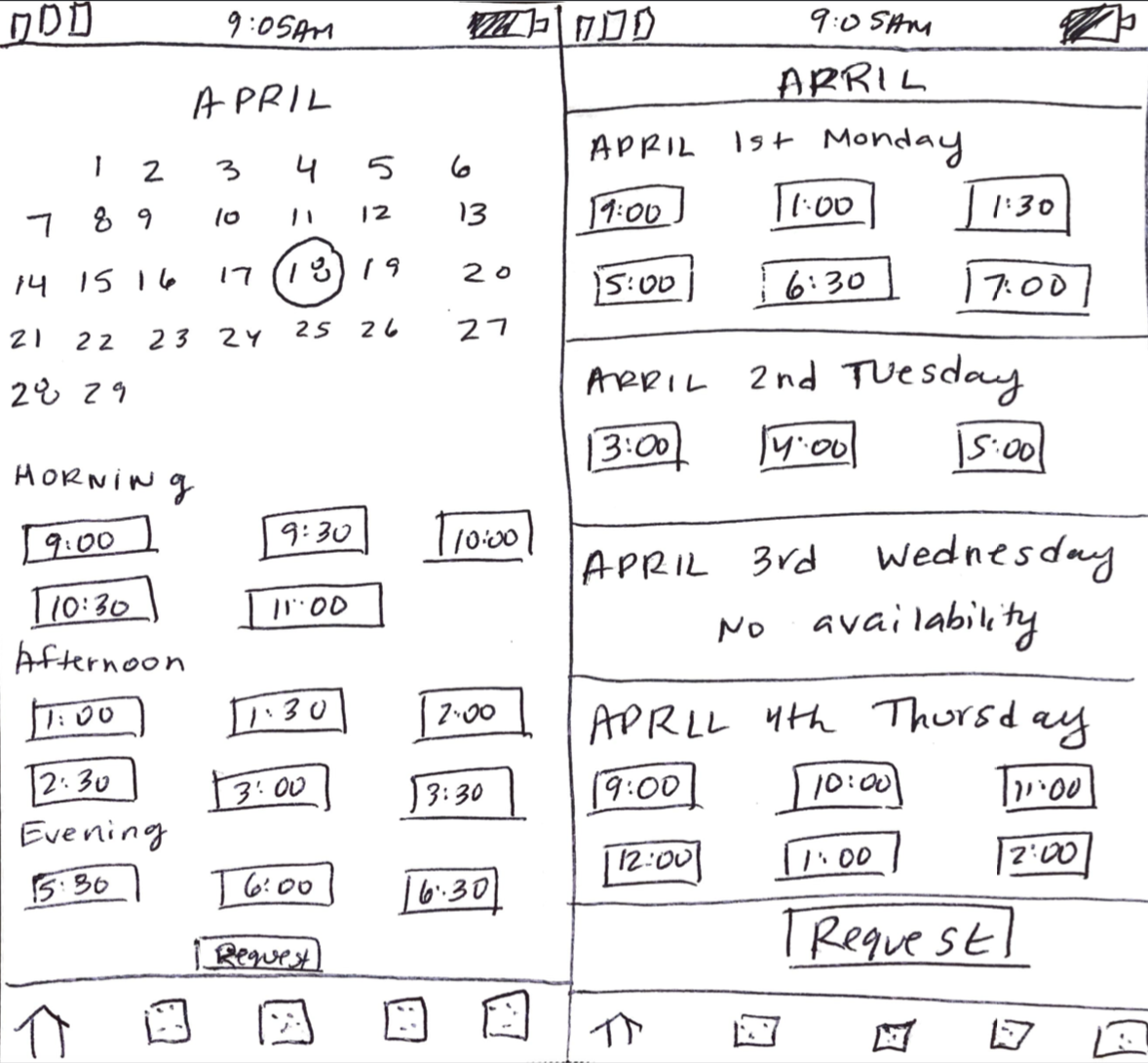
As a design team, we discussed which sketches we thought worked and which aspects to explore in subsequent designs. From my Crazy 8 sketches, we agree that incorporating a full calendar with a circle that indicates the date followed by a listing of available times would be a good route to explore further.
Through the ideation process, our team explored new possibilities and collaborated with one another by giving feedback on the direction of our most critical screens. With this, we were ready to begin making more concrete design decisions through wireframing and higher fidelity mock-ups and prototypes.

0.4 DESIGN
Wireframes & Designing the New Screens
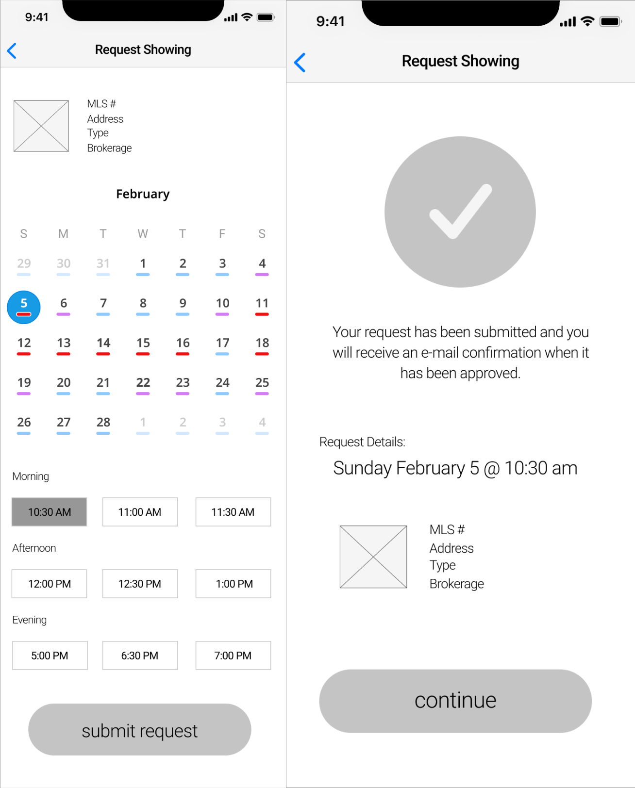
Using the direction that we brainstormed during the Crazy 8 Sketching exercise, we each took our critical screens and developed the wireframes that completed our user flows. I referred to the plans for the red route that structured out in the user flows as well as the critical usability issues chart to guide me through the creation of the screens and make sure that I addressed the recommended improvements.
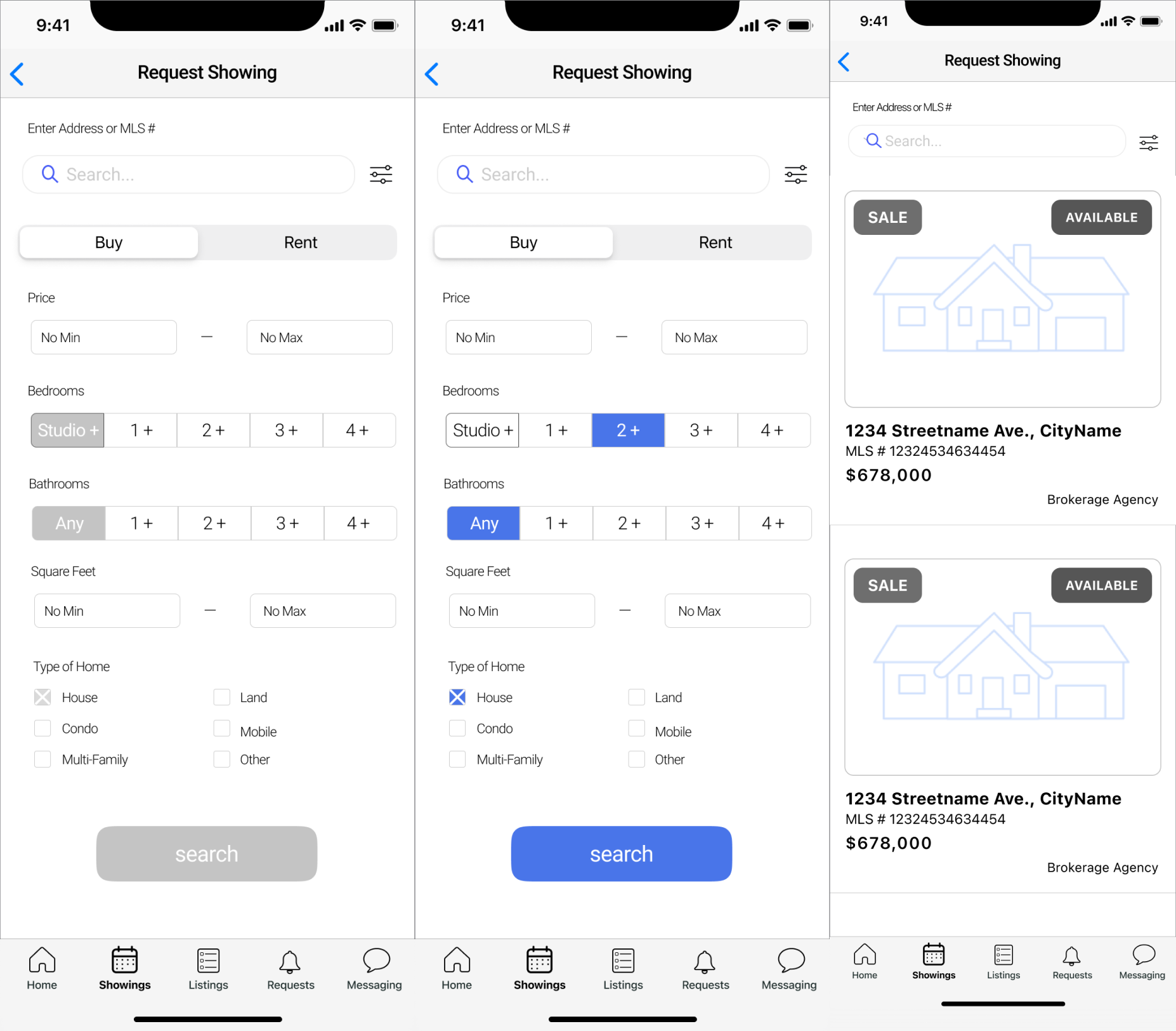
These wireframes take into consideration what the user will see and be able to access in route to complete their desired task. Thinking about the users, I included the ability for agents to search for property listings using various search filters. My wireframes follow the task of requesting a showing to view a property and take the user through searching for a property listing and eventually requesting a time to view the property.


Wireflows & Simplifying the Scheduling
Using the wireframes, I planned out my red route into a wireflow to visualize and double check the route that the users will take to complete their tasks. Many of the recommended design solutions that were identified in the critical usability issues involved minimizing the interface and simplifying the process for users.
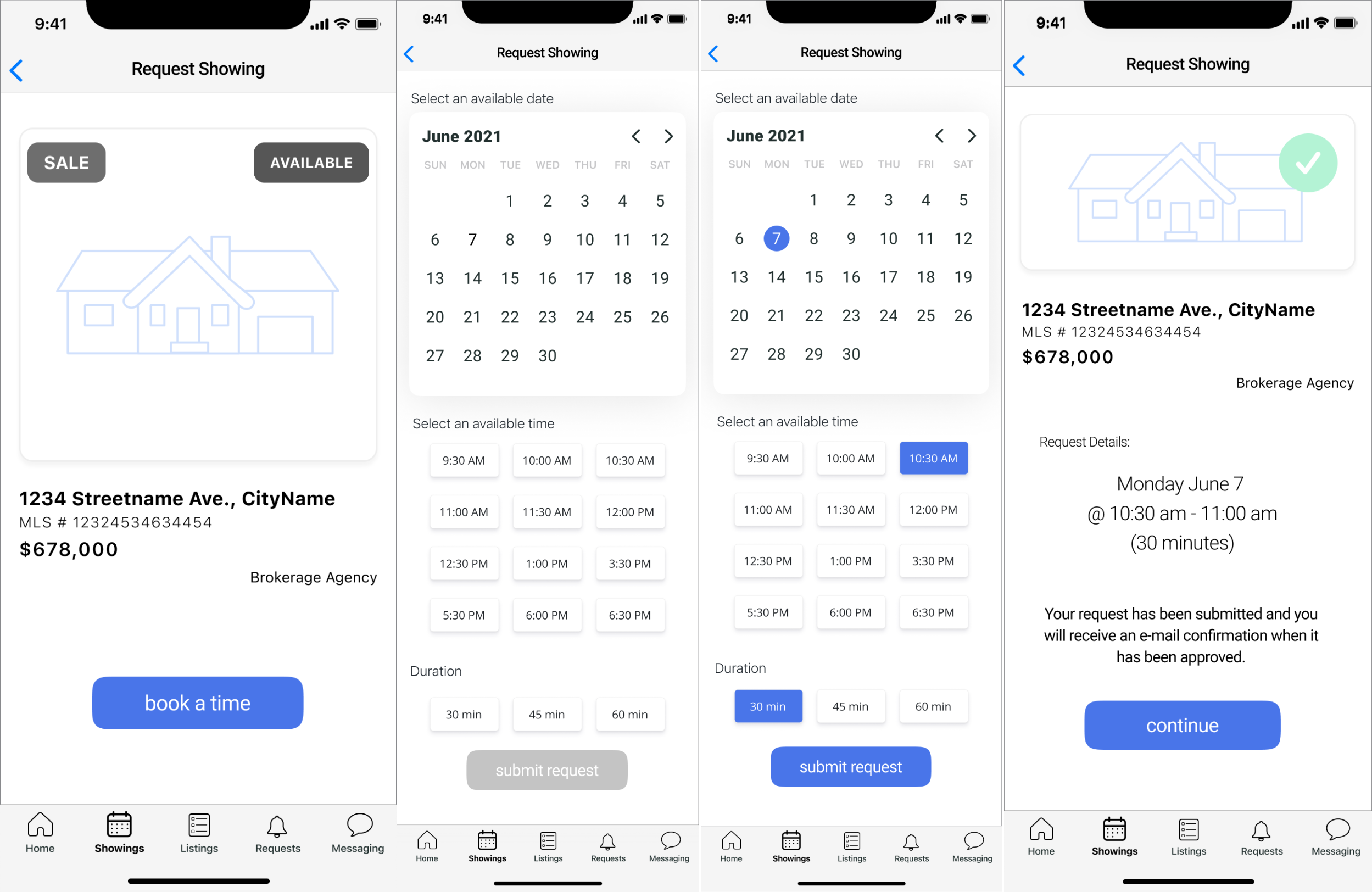
My solution involved including only the most crucial actions and updating the way that users scheduled their appointments requests. This wireflow finds the property listing using the MLS number, which the CEO said was the most likely way that agents would find the listings they were interested in. By seeing my wireframes in the format of a wireflow, I double checked my solution to see if it solved the problems that I set out to address. Below is the wireflow of my task:

Updating the Style & Components
The main influences for my component and style choices were based on the results from the critical usability issues and heuristic analysis that we explored during the research phase.
Updating the way users select the time and date


My solution to these issues is to have users select their desired date using a calendar that is highlighted in an action color. When the date is selected, a list of times that the listing agent is available show up beneath it. The scrolling picker is eliminated and the user touch points are reduced to a single click for their desired date and another one for their time. The buying agent can be certain that the listing agent is available, eliminating unwanted schedule conflicts.
2. Reformatting the Property Listings to Fit the Information
A consistent issue that we saw during the heuristic analysis was the crowding of information on the screens. This makes it difficult for the user to sift through information and absorb important tasks available on the screens. In Schedulock’s original design, there were a lot of tiny listings stacked closely on top of one another creating screens with a lot of information. I identified two main issues with this format: 1) By having the property photo next to the listing information, neither the photo nor the address is easy for the user to see. The crowded space does not fit the address and important details like the city and street address may not fit on the screen. 2) The hierarchy of text is not highlighting important information effectively. The title line is in a lime green color that does not pass color accessibility standards, making it difficult for many users to read. The rest of the information is not distinguished nor organized well to let the user easily scan the listing info.

We decided to restructure the property listings to better fit the information and give users a better experience in scanning information as they go through the listings. To do this, we decided that putting the image above the info would give a better visual of the property photo as well as provide room for the entire address to fit under the image. Since the photo was larger, we decided to add status indicators on the top so the user could quickly understand at a glance. We bolded the street name and price, since this information was the most important and the brokerage agency and MLS numbers off to the side, since this is more secondary information. Even though there are less listings on the page with the new redesign, each listing is easier to scan as the user scrolls through.
3. Making the Call to Action Buttons Accessible for All Users
During the initial UX audit, our team tested the color accessibility of their main lime green color - and it did not pass the accessibility testing. This means that not all users may be able to easily read or use the buttons or highlights using this color and the use of this color palette is not meeting the necessary objectives that an application needs for users to use it.

Our solution was to suggest a variety of color palettes for the stakeholders to choose from, including this blue which passes the accessibility testing. I also included a larger text size for better user readability.
Putting the Designs Together
With the updated components and the refreshed style of our design choices, I put the designs together into my wireframe user flow. Because of time constraints, we worked at a mid-level fidelity.


0.5 PROTOTYPES & USER TESTING
In preparation for user testing, we transformed our user flows into prototypes so the test users could complete tasks as if they were already active. I uploaded my user flows into InVision and made all of my buttons and links become clickable and looked forward to seeing if the users were able to successfully request a schedule showing.

For our user testing, we combined all of our screens together into one cohesive prototype for our test users to navigate through. Alice and I took the lead in the user research and testing and we created a usability test plan and script. We recruited as many current Schedulock real estate agents as possible and narrowed down our questions into tasks to see if each of our designs provided a useful solution to our red routes.
The tasks that we tested were:
Dashboard understanding & feedback (Jon)
View today’s showings on a map (Jon)
Contact agent on a listing (Jon)
Edit address to a listing (Alice)
Change availability of listing (Alice)
Make a showing appointment (Diana)
The main objective for the testing was to figure out if the current design, structure and flow of our redesigned interface is suitable to allow the users to accomplish these high priority objectives. The tests were conducted remotely through screen sharing the InVision and Figma prototypes and our user testing participants consisted of three current real estate agents who are current users of the Schedulock platform.

0.6 TESTING RESULTS & ITERATIONS
Assessing User Feedback
The outcome from the usability testing was very useful to learn about the thought process of the users as they navigated through the app. The feedback on the testing allowed us to develop a better understanding of the parts of the design that were working and not working as intended.
I focused on the testing results from my own user flow only and received the following feedback:

Issue #1: From the dashboard, users could not easily find the beginning of this user flow and had to be guided to find it. The buying agents assumed that it would be located under the listings bottom bar icon, but this is where the property listings of the listing agent were found.
Issue #2: Users want distinction between the time and the duration sections. They read the duration squares as a continuation of the time squares. One user suggested that when one section is complete, it auto-scrolls to the next section.
Iteration Recommendations
The most critical issue to be addressed on this user flow is that the user does not easily find the listing search from the dashboard and confuses it with the property agent’s listings.
Since this app involves three distinct users: the listing agent, the buying agent and the brokerage firms, there are two types of listings that can be found. The first type of listing is particular to the listing agent, who would expect to find a list of their uploaded property listings to track them and edit them. The second type of listing is particular to the buying agent, who would be searching for listings for their clients and would like to request showing appointments.

My recommendation to fix this issue is to clarify the action buttons with labels to distinguish the types of listings. This could include: “Search Listings” so the buying agents knows to search and “My Listings” so the listing agent knows that these listings are the ones that they uploaded.
Although the users all managed to select the date, time and duration to request a showing, many of the users mentioned that the time and duration sections seemed the same. In order for the users to better understand the differences, I would suggest that the duration button be replaced with a sliding time bar.
Final Thoughts
While redesigning the Schedulock mobile app, our design team faced a few different challenges that helped us to identify new directions to explore and reassess existing features to create the best solution for the users.
One challenge was the learning curve that we faced in redesigning an app for real estate professionals. None of us on the team came with a real estate background, so we spent many hours researching the industry to better understand what things a brokerage or an agent would need to have managed while using this app. We learned that a real estate agent doesn’t have just a single role, but rather they distinguish themselves based on if they are more involved with buying or selling. These became crucial details while designing for the three different users in mind.

Another challenge was putting our user flows together. Since we worked within time constraints and the project was quite complex, we divided the user flows amongst our design team. Within our individual user flows, the details and flow were thought out well and worked as intended. When we put everything together into our prototypes for user testing, we experienced some challenges to fix with connecting things together. Because of the different roles of the agents, there was some overlap between listing searches for the listing agents vs. the buying agents, since they involved similar screens but were used for different purposes depending on the role of the user.
As we become more aware of these project challenges, we put this knowledge at the forefront during our iterations and recommendations for future designs.