
Grow: A Case Study
The Grow app is solution to help people research socially responsible investments to take control of their finances and their future.

Overview
The world around us is often full of conflict and challenges. From the natural environment to the relations between political parties to the unrest between groups of people to the disparities between lifestyles. But it is also full of cooperation and opportunities to do better each day. The inspiration for my capstone project is based on my own feelings of uncertainty in society and the need to be a part of a solution to make things better. As a consumer, I know that I have power in my purchasing choices that create a demand that supports a business's product and vision. The purpose of this app is to turn consumers to reframe themselves as investors, no matter how small their support begins.
My Role
While developing this financial research app, the job roles that I performed were UX Researcher, UX Designer, Information Architect, Visual Designer. Mainly, I kept the user’s needs at the forefront of all decisions throughout the creation of this application. Throughout the UX process, I was also in charge of conducting all the primary and secondary research, organizing the surveys and interviews with my target audience, developing personas to help better understand pain points with potential users, putting together wire frames, identifying user flows, creating the style guide, and a developing working prototype of the application.
-

The Challenge
How can we create a platform to enhance the power and confidence of the individual investor to find and invest in stocks that align with the values of a future that they want to create?
-

The Solution
The stock market can be a powerful resource to invest in companies whose visions mean something to you and contribute to the growth of their mission. I will create an app to simplify stock market research to enhance the power of the individual to find companies and stocks to invest in, that align with the values of a future that the user wants to create.
Discovery
Secondary Research
With the emergence of online trading platforms that give market access to retail investors, it has now become easy for individual users to invest their money into the stock market. Research data shows that individuals recognize the importance of their actions in social and environmental settings and are eager to invest their money in line with their values.
Even though it is easy for individuals to trade online - on their own terms and without fees - studies suggest that users who are new to investing don’t trust in their investment knowledge to trade independently. As a result, it is common that individuals with limited experience:
Seek out a financial advisor
Invest in safer financial products such as bonds of CDs
Don’t invest their money at all
This lack of knowledge and confidence by individuals, disempowers their ability to invest in causes and companies that mean something to them.
Research supports that investing in future-forward causes are smart financial decisions.
According to a recent bank report, the direction of the global markets are changing and opening up new possibilities to invest in the future. Across the board - investors, banks and companies alike - indicate that they prioritize social responsibility as well as high returns on investments, which are increasingly one-in-the-same.
Heuristic Analysis of Competitors
After doing my secondary research to better understand socially responsible investing in the financial world, I explored companies in the field of financial technology that focus on both investing and researching. I chose to explore the apps: Finhabits, Impact Metro and Investmate because they incorporate researching with investing strategies.
-

Finhabits
An app that is centered around learning and developing good habits about investing, while investing. The platform guides you through the process of learning about investment strategies, understanding your goals and making decisions to keep you on track with your goals. I appreciated that the app had visible and easy to recognize information, was adjustable based on the preferences of the user and had a minimal, clean design.
-

Investmate
An educational app that enables users who are interested in investing, to learn the basics of finance on the go. Users can choose the learning goals that they are interested in and be guided through a daily lesson that is centered around historical events and structured like a game with levels that build on top of one another. The reduced information and the use of familiarity on the interface make it easy for the user to recognize the options that they have on any given screen in this app. The possible options on the app are limited to only the most important and they are displayed using familiar icons. The Investmate app offers the entire educational experience to be personalized to your investment interests and commitment preferences. The aesthetic design of the interface is minimal and uses a nice color scheme to highlight information and convey information with color.
-
Impact Metropolis
A free app that compiles free-to-access resources for public engagement with the impact investing ecosystem. This platform is an educational resource for investors, advisors, asset managers, researchers and more - to research trending news on sustainable and impact investing throughout the global and local communities. This platform definitely has valuable information in it, but it is not designed very well with the users in mind. The interface is very poorly organized, there is no ability to personalize the app, and the amount of information is overwhelming to look at and navigate through.
User Surveys & User Interviews
The main goal of the survey was to Identify how to focus the design of the project by understanding which features to incorporate into the research investment platform.
Figure out how to assess company information in terms of company values, a term that may be subjective
Understand what social and environmental issues are most important to potential users
Identify what information they want to know in a company to help them decide whether to invest in it

After my interviews with target users, I compiled some of the key user quotes:

Affinity Map
Once the interviews were finished, I collected the interview participants’ defining quotes and put them on a board in an affinity map. I compiled them into groups that express similar thoughts and ideas.

By mapping the interview insights into an affinity map, I was able to see consistent themes about the investing experiences and philosophies of the individuals that I interviewed. Their common experiences are:
Have a lack of confidence in financial management abilities, but would like to learn more
Have investments that are managed by someone else and feels reluctant about it
Are held back by fear or uncertainty of the stock market
Have an investment strategy or philosophy in some form
Believe in the potential of investing as a tool for societal change and the future
During my interviews, I was taking notes on the participants’ answers to my questions and each person had a different story, perspective and way to express their experiences. By going through the process of affinity mapping, I was able to focus on each quote anonymously and group together the quotes that expressed similar needs. Common themes became clear and defined the needs of a unified user, that would become the basis for the development of my user persona.
User Persona
With the information from my user research, I was able to compile the findings into the ideal target user.
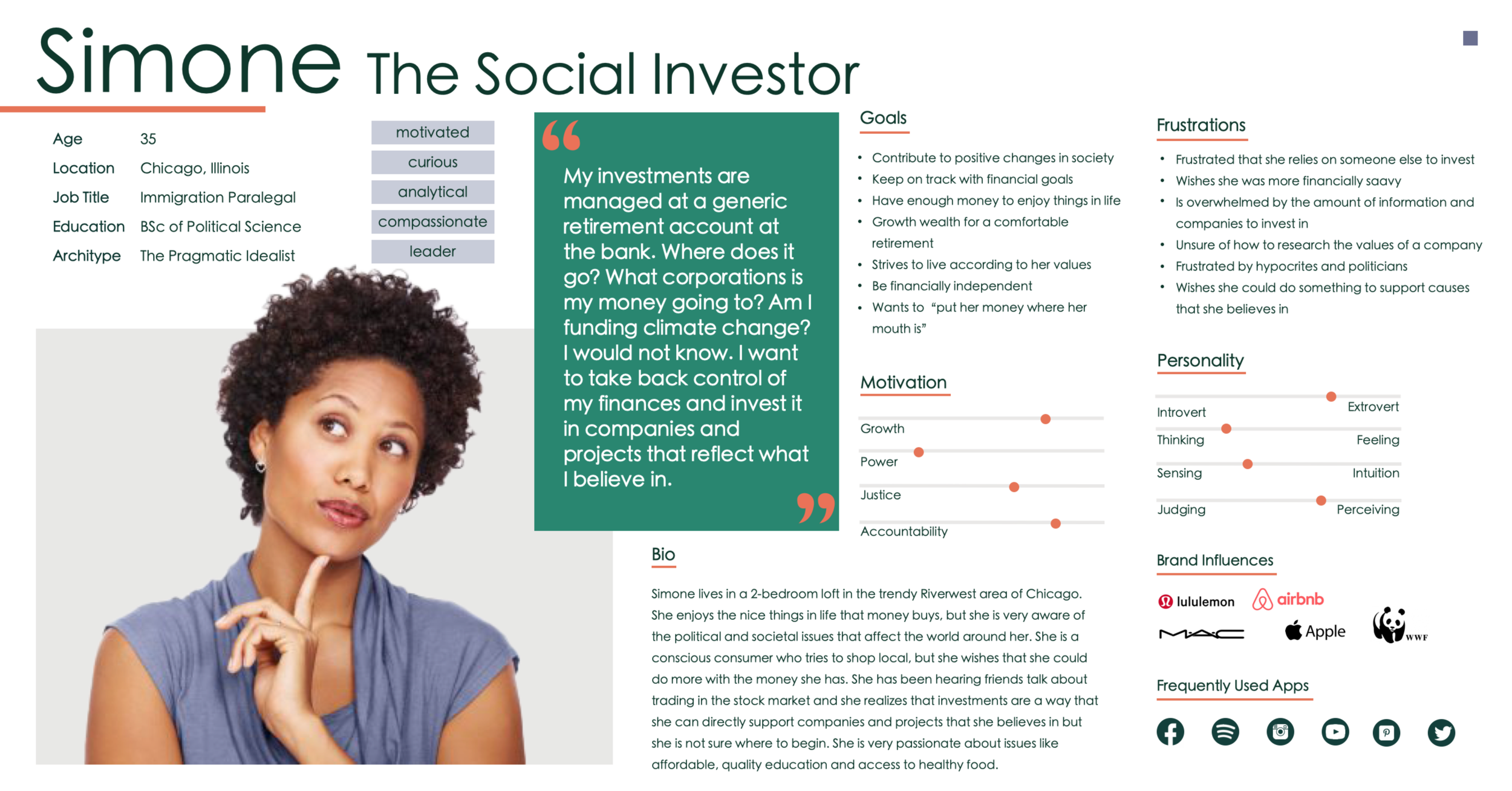
I introduce to you: Simone, The Social Investor. She is 35, lives in Chicago, works as a paralegal and is a pragmatic idealist. She Is motivated, curious, analytical, compassionate and a leader. Some of her goals include: the desire to contribute positive changes in society, keep on track with her own financial goals, and live according to her values. Some of her frustrations include a frustration that she has to rely on someone else to invest, she wishes she was more financially savvy and she is overwhelmed by the amount of information and companies that she can invest in.
Simone’s defining quote is: “My investments are managed at a generic retirement account at the bank. Where does it go? What corporations is my money going to? Am I funding climate change? I would not know. I want to take back control of my finances and invest it in companies and projects that reflect what I believe in.”
Conducting the interviews and developing the user persona was very useful and allowed for some key takeaways:
First, users rely on experts to invest their money because they do not feel confident in their own ability to invest
Second users feel reluctant about trusting experts and feel confident that they can learn how to invest on their own with the right information and tools
Third, users have a desire to build their wealth while using it to create positive changes in society
This looks like a great start to solving the initial problem that was presented at the beginning: how to simplify stock market research to help individuals find companies and stocks that align with their values.
How Might We…
With this user research completed, I have a clearer definition of how I might approach solving this problem as summarized by my “How Might We’s…”:

With a clearer vision of our target user and better definitions for ways to approach the initial problem, I continue forward developing the solution through the information architecture, wireframing, prototyping, and the testing phases.
Information Architecture
User Stories & MVP
After the secondary research and interviewing users, I had a much better idea of what the users needed and narrowed down the possible features into my user stories. These user stories defined the tasks that would be needed to create a value that the users would need to accomplish their goals with the app. This list of tasks was divided down by importance and I focused on the MVP tasks that were necessary to create the minimum viable product that became the basis of the interface features of the app.

Sitemap
With the features that were determined during the user stories, I conducted an open card sorting test to understand how the users would categorize the features into pages. With the results of the open card sort, I created the following sitemap for the app.


User Flows for the Red Route
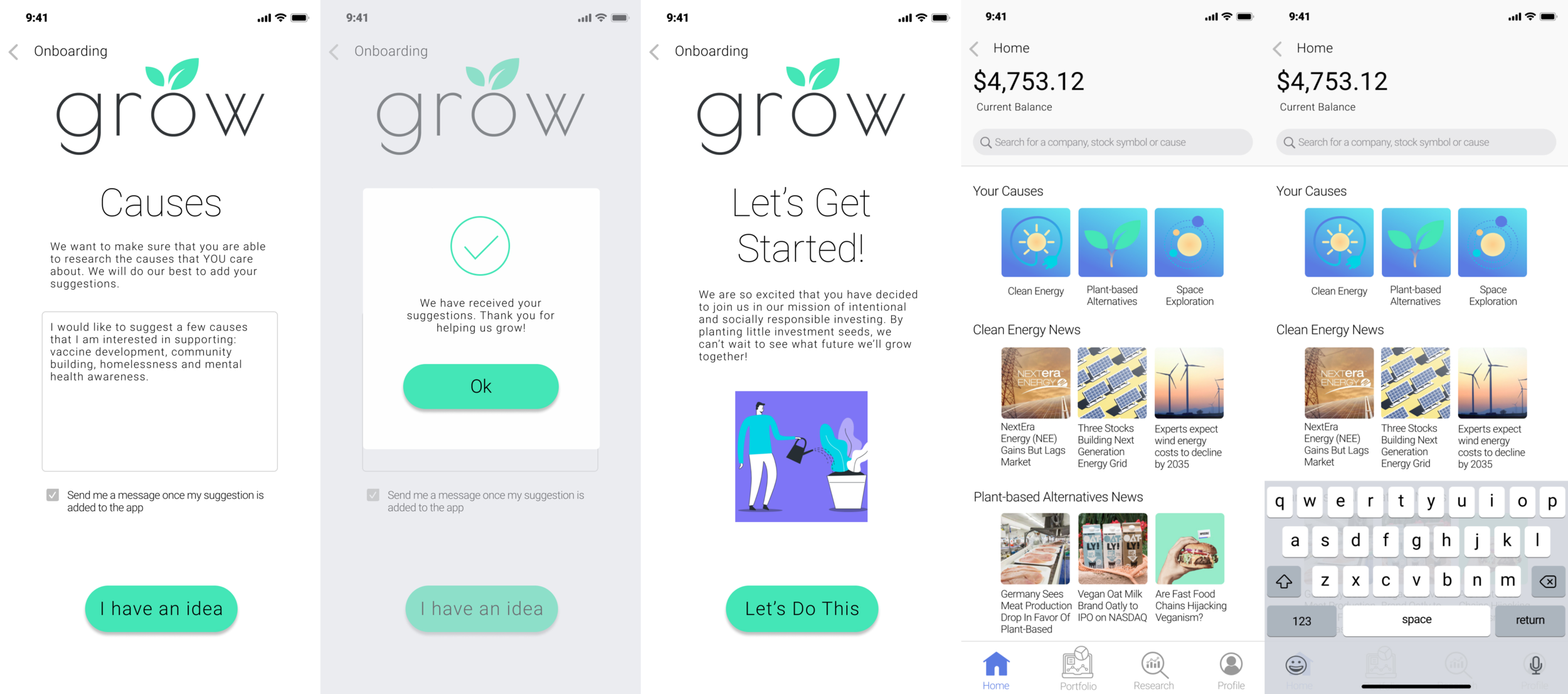
Using the categories that were defined with the sitemap, I began to create the user flows to plan the routes that would lead the user to perform the red route of the app. With each category from the sitemap representing a page of the app, the user flows continue to develop into determining which options should be available on each page to guide the user through the app to complete the red route. I created user flows, which include: completing the onboarding process to personalize the content of the app, research information on a particular topic, and buy a stock based on the company value.
Red route: “A place to research and invest in companies that are aligned with user values.”
Design
Sketches, Guerrilla Usability Test, & Wireframes
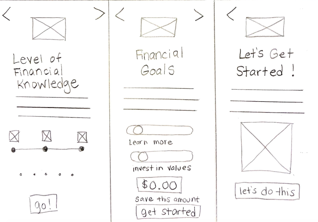
With the plans for the red route structured out in the user flows, I was able to understand what the content of each screen should have as the user moved through to complete their tasks. The following wireframe sketches are the beginning plans for the design of the interface. In order to see if the wireframe sketches worked as they were intended, I conducted a Guerrilla Usability Test with them to assess the functionality of their design.
I identified the following red routes:
personalizing the content of app through the onboarding process
finding a specific stock based on a value search
buying a stock - and I sketched out my envisioned structure of the app based on previously identified user features.
I was hoping to discover how test user participants moved through the app and it was meeting their needs.


My main focus during the testing included:
The self-reflection prompts in the onboarding process and how the users found them. Were they useful, pointless, inspiring or invasive and how could I best personalize the app as well as inspire users to identify their own goals in using the app.
What information did the users expect to see on the homepage? Did they want to see articles on new trends or company highlights?
What information was important for the user to understand in a company to understand it’s values at a glance?
I uploaded my sketches into the Marvel program and conducted the guerilla user research on my desktop computer in both in-person and remote testings to my available network at random. The participants represented a range of ages from 28-65, both liberal and conservative political leanings and all had experience in investing in the stock market.
During the Guerrilla Usability Test, the test users pointed out a variety of useful suggestions as they went through the prototype and shared their thoughts on the experience. My initial sketches were complete enough to get an idea of what could be happening on each screen, but incomplete enough for users to tell me what they imaged on the page to fill in the blanks. Based on the Guerrilla Usability Testing, these are the main needs that the users expressed they wanted during the experience:
Users wanted a more in-depth approach to personalize their financial goals in the onboarding process
Users wanted to customize their app to find their specific causes
Users want more information on the company investment pages
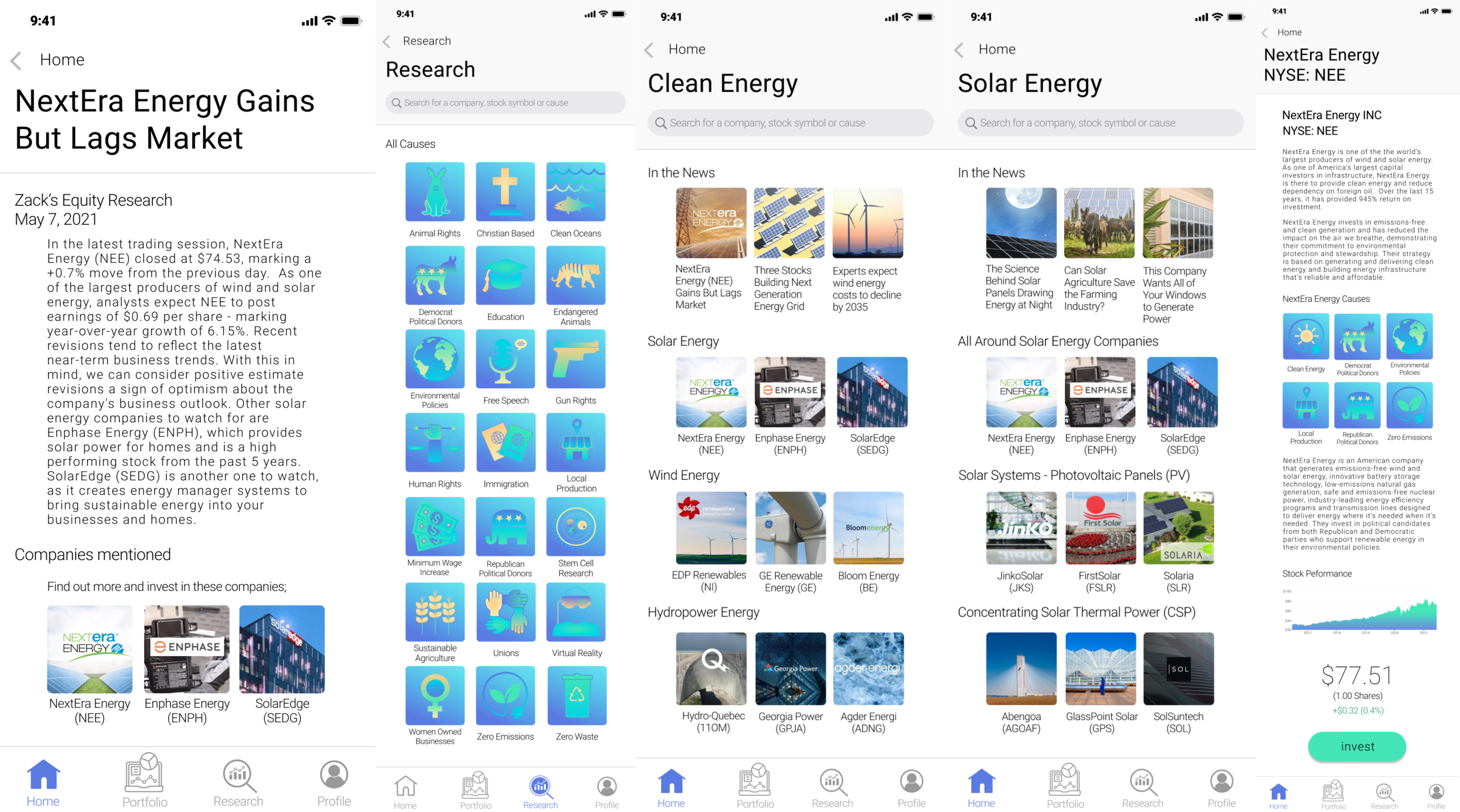
Users expected to see research articles - in the form of news - on the homepage, instead of company highlights
The guerrilla user research proved to be very helpful in understanding what the users expected and where the sketches were lacking. Based on my usability testing, I made the following adaptations to the next round of wireframes:
rework the financial goals section in the onboarding process to be more relevant in assessing the users goals and motivations for using the app, including incorporating goal reminders into the app itself
add research based articles (including trends and top 10 lists) into the homepage selections, instead of limiting to company specific highlights
add the ability to suggest a cause during the onboarding process
add more detailed information on the company stocks that give a broader and more-in depth look into the values of the company.


Wireflows
With the wireframes, I planned out the red routes into wireflows to visualize and double check the route that the users will take to complete their tasks. Below are examples of two of the three wireflows that I created for the app.

Moodboard
Before creating a high-fidelity prototype of the app, I needed to develop a clear idea of the look and feel that I wanted for the app. From my initial research and interviews, it was clear that my target users were action-orientated leaders that cared about making positive changes to the world around them. After completing the heuristic evaluation, having a minimal yet bold interface was important to create the right feel.
I wanted the visual design to be inspiring, bold, action-orientated and invoke a feeling of growth. As I put together the moodboard, I was inspired with the name of the app: Grow.

Style Guide
Now that the mood board was created to capture the intended personality and style, I began to develop the style guide for my newly named app - Grow. I chose the name “Grow” because it was a simple reference to the purpose of the app: growing projects whose missions they believed in to grow the future that the user envisioned while growing their investments.

I wanted a simple and stylish font for the logo that was bold, but not distracting. I chose Poiret One for the logo font, accented with a variety of Roboto fonts for the rest of the app.

The chosen color palette incorporates a bold blue with a lively green and a soothing yellow as the primary colors. Together they feel like they embody the bold, action-based, environmentally inspiring research investment app that embodies the personality of the user persona and their mission on this app.

When the information is filled in completely on the screen, the primary action button will change from the disabled grey to a lively green - a call-to-action button that indicates “go” as well as the subtle reference to growth, money and the natural environment.

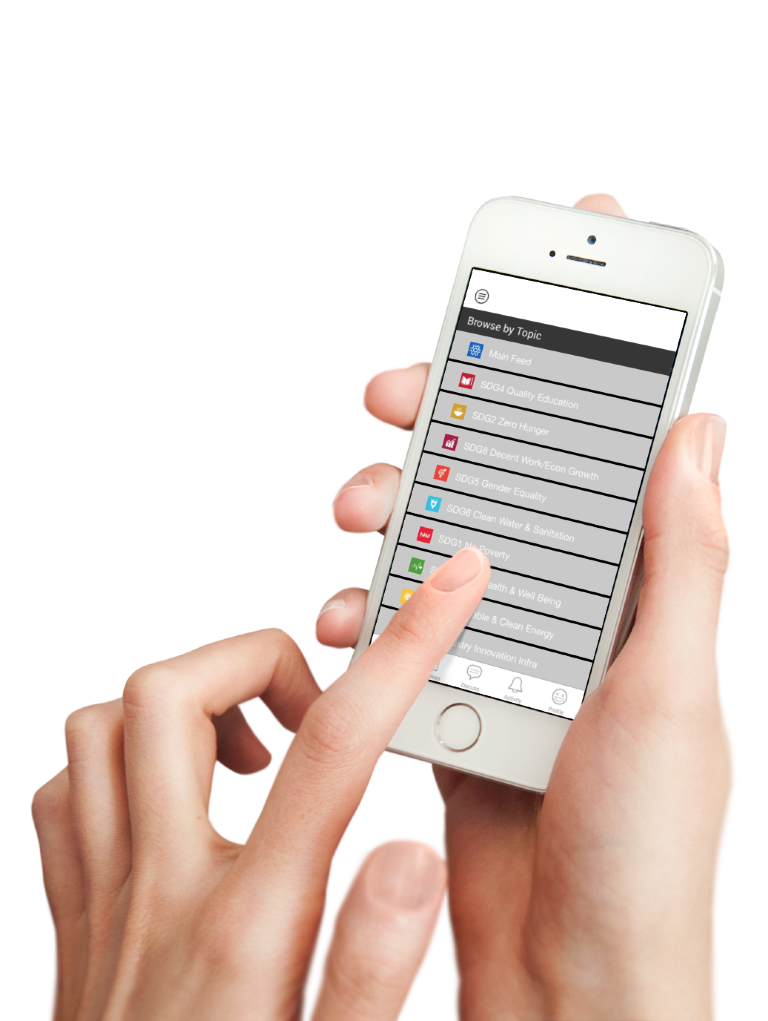
During the Heuristic Analysis, one of the companies that I researched did a memorable job of creating visual icons to represent the different topics that the user could research further. Since the users expressed that it was important to have the ability to personalize the app to represent the causes that are important to them, I wanted to include visual representations of each cause to help the users scan information quickly and create easily recognizable visuals to help them go through the app to find different information.
Users also wanted to measure the progress of their goals as well as track the growth of the companies that they were interested to invest in. I added graphs into my style guide that were designed to show growth by changing into green as the user gets closer to their goal or as the charts get higher.

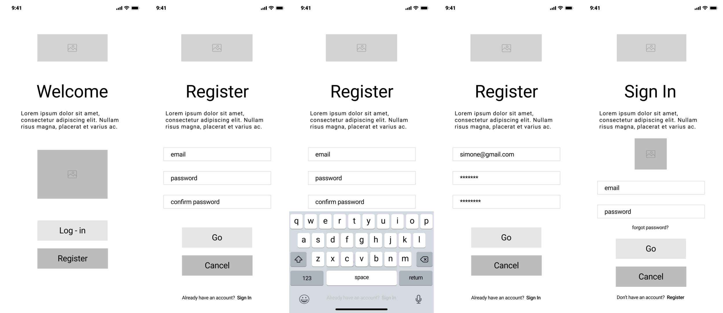
Screen Evaluations
With the style guide planned out, I took two wireframe screens and added the elements of the style guide to test out what the design will look like on the actual pages of the app. For the mock-up screens, I designed the screens following the iOS guidelines. The guidelines include: formatting the content to the screen, incorporating touch controls for a natural interaction with the app, making sure hit targets are at least 44 x 44px for accurate tapping, readable text size that is at least 11 points, an appropriate contrast between the text and background for maximum readability, proper spacing through height and letters, making sure to use high resolutions versions, no image distortions, an organized layout that makes sure controls and content are close to each other, and a consistent interface alignment for all the text and images.

I made sure to format the content to the screen so that there was no zooming or side swiping to see what’s on the page. All of the intended materials fit on the screen and additional content can be found by clicking on arrows on the sides. This allows for a variety of categories to be on the screen and highlighting relevant ones for the user, inspired by the Spotify app. The smallest text on the app is 14 points, larger than the suggested 11 points, to allow for it to be easily used for a wider range of users. All of the clickable text is separated by the recommended 22 px space from other text or buttons. Initially, not all of the text was spaced out according to these guidelines and was adjusted to fit this standard. The images are high resolution versions without any distortions. The interface was aligned using a 4 column grid with a 12 px gutter space and all similar controls and content are close to each other. The buttons and text are consistent and follow the rules of the style guide.
The design of the Grow app could incorporate more feedback as recommended by the IOS guidelines. Feedback could be done by giving more feedback when tapping on some part or more progress indicators like a chart as users go through the onboarding process. While setting up the grids and spaces, I used pixels in addition to the points for other parts of the design. The guidelines recommend always designing using points instead of pixels since there is a variety of screen displays, so this is something that I will incorporate in further design decisions.
High Fidelity Mockups for Red Routes
Once I adjusted the mock-ups to reflect the rules of the style guide and the iOS guidelines, I created high fidelity mockups for the red routes. I developed the written content for the pages and added all of the style elements to create the app as up-to-date and complete as possible. This mock-up was made to have all of the screens that a user may find while going through the app including pages with the text keyboards, search bar results, deactivated and activated pages and confirmation pages.


Prototypes
The high fidelity mockup screens were then uploaded into Invision to make a prototype of the app. The buttons and links became clickable through hotspots so that users could go through the app almost like real-life to complete their red route.
Validate
Usability Testing
Using the Invision prototype, I created the usability test plan to explore how the user navigates through the app to accomplish the site’s red route as a place to research and invest in companies that are aligned with user values.
. The main questions were:
Can our users research the causes they care about and the companies that provide them without confusion?
Do the users have enough useful information to learn about a company's values confidently enough to invest in them?
Does the onboarding process ask the right questions for the users to personalize their experience in the app?
The main objective for the testing was to figure out if the current design, structure and flow of the Grow interface is suitable to allow the users to accomplish these objectives. The user testing participants consisted of people who are interested in social causes and who have experience with investing, either by themselves or through an investment manager. The tests were conducted remotely through screen sharing the Invision prototype and were done with four participants who I recruited through my personal network.

The outcome from the usability testing was very useful to learn about the thought process of the user as they navigated through the app. The feedback on the testing allowed me to develop a better understanding of the parts of the design that were working and not working as intended.
Issue #1: Users do not feel that they have enough information about the company’s values to confidently invest in them. The users wanted more information on the company. They asked where the company was based, what its market performance has been, and how the company measures up with other causes.
Issue #2: Users want a more comprehensive cause icon list on the onboarding process that is easier to navigate. The user wanted more cause options to select from and to navigate through the causes in alphabetical order.
Issue #3: Users want clearer calls to action when investing. During the user testing, one participant was not clear on the meaning of the button “trade” when trying to purchase a stock, which prevented them from completing their red route.
I organized the usability issues into order by priority and my recommendations moving forward:


Iterations on Grow
Based on the user testing, I made some iterations to improve the design, structure and flow of the app to help the users better accomplish these tasks.
The first issue was that users did not feel that they had enough information about the company’s values to confidently invest in them. This issue was addressed by adding significantly more background information on the company including: additional information on the projects, the cross-listed causes that the company fits into using the cause icons and the visual displays of the growth of the company using a diagram of the company’s stock performance.

The second issue was that users wanted a more comprehensive list of causes in the onboarding process that was organized and easier to navigate. This particular section caused a lot of excitement, since politics can often be full of opinions, so I focused on the functionality of this page instead of particular causes that were - or were not - included. There is a link at the bottom for the user to make additional suggestions that will be implemented in future app iterations. In order to organize the causes better, I followed a user's suggestion to alphabetize the causes for easier selection and not to promote any sort of subconscious cause hierarchy.

The third issue was that users wanted clearer calls to action when investing. At least one user participant did not know to click on the “trade” button to invest in the company stock. She clicked all round the app to “home” and “portfolio” and said that the word “trade” was confusing to her. While the word “trade” is often used on financial apps, I decided to use a clearer word of “invest” on the button, to see if users found this easier to understand.
After completing the iterations on the prototype, I conducted another round of user testing to see if the changes improved how the user was able to navigate through the app in order to accomplish the site’s red route. During the second phase of testing, the users were generally pleased with the amount of information about the company. They felt that they are able to conclude if the company is on the right track with the causes they care about. Users are able to understand why the icons are there and what they represent to the company and its cross listed causes.
“Yes, it gives me the right information. I can see that the company’s mission is on the right track doing the things that we need to do to stay on track for the future of our planet. “
“ I think the icons represent the purpose of the company and the company’s mission. I think the information is very comprehensive. This is wonderful!”
One of the users wants even more information, specifically additional links to recent news articles to understand what the company is currently doing.
As for the icons, the users said that the causes were very well organized and noticed that they were in alphabetical order. The users felt like their causes were either represented or could be represented based on the ability to submit a suggestion. One user suggested how nice it would be to have the ability to add new causes instantly, which would be ideal.

All of the users in the second testing had no issues in knowing to push the “invest” button. This seems to be a more intuitive call to action word for this page.
Moving forward, I would recommend adding more user suggestions to the cause list to give users more causes to support - ideally instantly. I would also recommend that the company description pages expand even further with their company information and include news links on the bottom for the user to be able to research deeper into the current with easy access to current news.
Insights & Key Takeaways
While developing the Grow mobile app, I faced a variety of unexpected challenges that helped me to learn to identify my assumptions, rework possible solutions, and come up with new features to better suit the needs of the users.
One challenge that I encountered happened during the Guerrilla Usability Testing, when I had the test users go to the causes page. I know that politics can be very divisive and bring out passions and excitement when people see their cause or a cause they don’t like. This app was developed to be nonpartisan and represent as many overreaching causes that I could think of, but of course I knew it would be a work in progress. During the Guerrilla Usability Testing, every test user that I interviewed, made comments on the causes that were listed - or weren’t listed - on the page. I could see a clear party divide on the feedback from the causes on the sketches.

As a result, I did more research on how to categorize the causes to be more encompassing and nonpartisan. I applied these new categories in the wireframes and based on subsequent test user feedback, I added a suggestion box - so users could feel represented by adding the causes that matter to them. I appreciated how honest the test user feedback was because it was important for the app to be an all-inclusive solution to research investment and the changes made it more accessible for users to find their causes.
Another challenge that I encountered involved the flow of questions on the onboarding process. It was important to personalize the app to give users the updated research information that was the most relevant to them. I wanted to gather the initial information for the app during the onboarding process through a series of questions. The answers to these questions would set the type of information the user would see once they were logged-in, but also ask questions for the user to reflect on what their goals are with investing. During the Guerrilla Usability Testing, my test users asked a lot of questions on the purpose of the onboarding questions. Some were hesitant to reveal their level of financial knowledge or a savings goal dollar amount and said they didn’t know why they were supposed to answer it. During the wireframes, I reworked the questions to get at the heart of what I wanted to know - what causes they were interested in and what their long term goals were to keep the users on track and engaged with the goals on the app. The next level of testing went very well and everyone seemed more engaged while going through the onboarding process. The onboarding questions had a clearer purpose and users appreciated sharing their suggestions and insights as they went through the process.

The last big challenge that I faced while I was developing Grow, was understanding how to get users to feel like they had the information they needed to have confidence in deciding whether to invest in it or not. I wanted it to be concise and visually understood at a glance so users could get the important information quickly. I added a summary of the company, its mission, its current projects, history of its performance and the stock price. During the first round of the usability testing, all of the users said that they needed more information to be confident enough to invest in it.

I added additional paragraphs with more company information and little icons to visually show the subcategories that it was a part of. However, during the second testing, the users wanted even more information. They wanted to know where the company was based, see performance charts from years ago, and understand all the different causes that the company influenced. I added all of this additional information and the page looked full of useful information and also allowed for scanning with visual icons to show the different causes. In user testing, I found out that the trust factor in learning about the companies really impacts whether the person will invest in the company, which is a red route for the app.
Next Steps
Moving forward, I would continue to listen to user feedback and make updates to enhance the user experience as they go through the red route. This would include adding more choices to the research causes based on the user suggestions. All users should be able to find and research the causes that they care about, since this is a main problem the app was created to solve. I would also continue to test and reiterate the information on the company page. The final testing of my reiterated mock-ups showed me that many users were happy with the updated, complete information - but that many of the users still wanted more information. I would continue to work these pages, including recent news articles and companies, until the user expresses that they have enough information to confidently invest in the company.